Responsive web design is an approach to designing and building websites that ensures optimal viewing and interaction experiences across a wide range of devices and screen sizes, from desktop computers to smartphones and tablets. The goal of responsive design is to create a single website that adapts and responds to different device characteristics and orientations, providing a consistent and user-friendly experience for all users.
Key principles and techniques of responsive web design include:
• Fluid Grid Layouts: Designing layouts using relative units (such as percentages) instead of fixed units (such as pixels) to allow content to adjust proportionally to screen size. • Flexible Images: Using CSS to ensure that images scale proportionally and do not overflow or become pixelated on different devices. • Media Queries: Employing media queries to apply different styles or layouts based on specific device characteristics, such as screen width, height, orientation, or resolution. • Viewport Meta Tag: Adding a <meta> tag with the viewport settings to control how the webpage is initially displayed on different devices. • CSS Flexbox and Grid: Utilizing CSS Flexbox and Grid Layouts to create complex and flexible layouts that adapt to various screen sizes. • Mobile-First Design: Designing the website primarily for mobile devices and then enhancing the design for larger screens. This approach ensures a solid foundation for smaller screens. • Responsive Typography: Using relative units and media queries to adjust font sizes, line heights, and spacing to ensure readability on different devices. • Testing and Optimization: Regularly testing the responsive design on different devices and adjusting styles or layouts as needed. Optimizing images and other assets to improve loading times on mobile devices. • Progressive Enhancement: Providing a basic experience for all devices and gradually enhancing the experience for devices with more capabilities. • Cross-Browser Compatibility: Ensuring that the responsive design works consistently across different web browsers.
Viewport meta tag
The viewport in web design refers to the visible area of a web page that is currently displayed within a user's browser window or device screen. It's essentially the portion of the webpage that the user can see without scrolling. In responsive web design, understanding and controlling the viewport is crucial to ensure that web pages look and behave properly across different devices and screen sizes.
The <meta> viewport tag is used to control how the content within the viewport is displayed on mobile devices, tablets, and desktop screens. It allows you to set the initial scale, dimensions, and behavior of the viewport.
Let's break down the attributes of the viewport meta tag:
• width=device-width: Sets the width of the viewport to the width of the device's screen. • initial-scale=1.0: Specifies the initial zoom level when the page is loaded. A value of 1.0 represents 100% zoom, which means the content will initially appear at its intended size.
Additional attributes that can be used with the viewport meta tag include:
• minimum-scale: Specifies the minimum amount the user can zoom out (pinch-to-zoom out). • maximum-scale: Specifies the maximum amount the user can zoom in (pinch-to-zoom in). • user-scalable: Specifies whether the user can zoom in or out. Use yes or no.
Media Queries
A media query in CSS is a technique that allows you to apply different styles to your web content based on specific conditions, such as the characteristics of the user's device or screen. Media queries are a key component of responsive web design, enabling you to create adaptive and flexible layouts that adjust to various screen sizes, resolutions, and orientations.
Media queries use the @media rule to define sets of styles that are applied when certain conditions are met. These conditions are typically based on features like screen width, height, orientation, device type, resolution, and more.
Syntax:-
@media media-type and (media-feature) {
/* CSS rules to apply when the media feature is true */
}
Let's break down the attributes of the media queries:
• media-type: Specifies the type of media being targeted, such as screen, print, all, speech, etc. • media-feature: Represents a condition or property that needs to be satisfied for the styles within the media query to be applied.
Here are some common media query breakpoints based on typical device sizes:
Mobile Devices:
• Small Mobile Phones: Below 320px
• Larger Mobile Phones (Portrait): 321px to 480px
• Mobile Phones (Landscape) and Small Tablets: 481px to 767px
Tablets and Small Laptops:
• Small Tablets: 768px to 991px
• Tablets and Small Laptops: 992px to 1199px
Desktops and Large Screens:
• Desktops and Laptops: 1200px and above
It's important to note that these breakpoints can vary based on your design and target audience. The breakpoints you choose will depend on factors like the content structure, user experience goals, and the specific devices you want to support.
Here's an example of how you might use media queries with breakpoints to adjust styles for different device sizes:
<!DOCTYPE html>
<html lang="en">
<head>
<meta charset="UTF-8">
<meta name="viewport"content="width=device-width, initial-scale=1.0">
<link rel="stylesheet"href="style.css">
<title>Media Query Example</title>
</head>
<body>
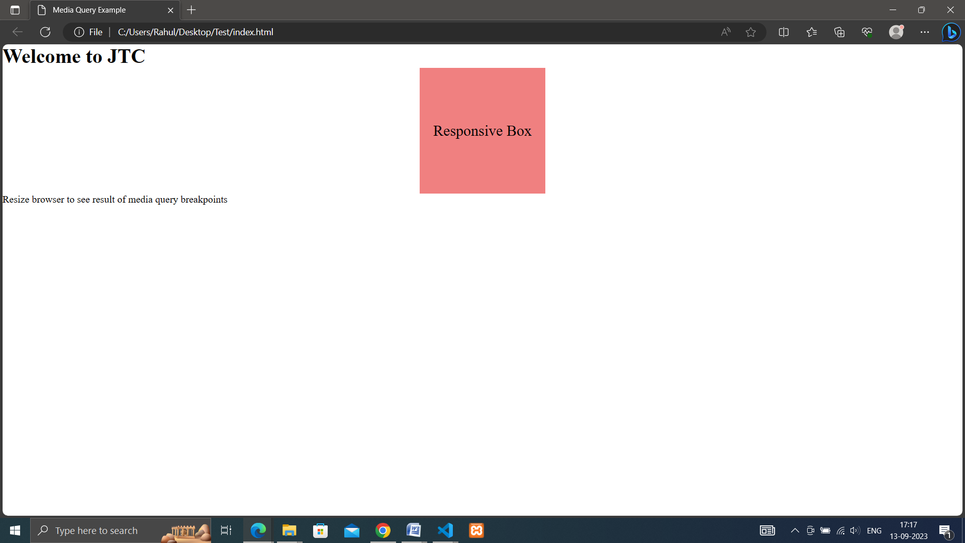
<h1>Welcome to JTC</h1>
<div class="responsive-box">
Responsive Box
</div>
<p>Resize browser to see result of media query breakpoints</p>
</body>
</html>
The media queries in the CSS file use different screen width ranges to adjust the background color and font size of the .responsive-box element for different devices:
For screens up to 767px wide: lightblue background and font size of 16px.
For screens between 768px and 991px wide: lightgreen background and font size of 20px.
For screens 992px and wider: lightcoral background and font size of 24px.
When you open the HTML file in a web browser and resize the browser window, you'll see that the background color and font size of the "Responsive Box" element change based on the defined media query breakpoints, demonstrating how the design adapts to different screen sizes
We use cookies to enhance your user experience. By continuing using our site, you agree to our use of cookies.